Accessibility
As administrators of any website, we are expected to take responsibility towards making our content accessible for everybody. The list below have essential tips that will help you to keep your website available for anyone interested in your site information. Assistive Technologies (AT) pay special attention to page’s structure and semantics. The better organized your content is, the easier it will be to navigate your page with a screen-reader.
- Use headings instead of changing the size of fonts to organize your content.
- Use descriptive links for URLs, rather than pasting a URL directly or using “click here.”
- When adding links, instead of adding the URL itself directly in the page, describe the location linked using verbs or keywords. Do not use “link,” “this link,” “here,” or “click here” as link text.
- Make sure to use Alt Text for each image, unless it’s purely decorative. Alt Text describes the content of the image. Good Alt Text helps the user understand the context and reason behind the inclusion of this image. See the Accessible Website Checklist for more information.
- Avoid using unnecessary images on your site. Keep your website concise and simple to avoid user distractions.
- If you are using multimedia content on your site, provide transcripts.
- Be careful with the colors you are using on your site. For more information about accessible colors, visit the Accessible Colors website.
Smith College Accessibility Support and Resources
- Smith College Technology Accessibility – Resources for the campus community to support college policy regarding technology accessibility including written instructions and links to software.
- Website Accessibility – Web-based tips for ensuring that websites are accessible.
- Office of Disability Services – Resources for students, faculty, and staff seeking support for academic accommodations. Email them at ods@smith.edu.
Headings
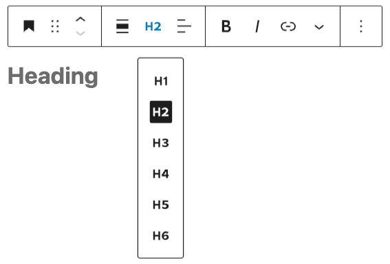
Headings are a special kind of text formatting and are useful for organizing documents and webpages.
Using the formatting options in WordPress, you can apply heading styles to your text (i.e. Heading 1, Heading 2, etc.). Headings make documents and webpages much easier to navigate for people using screen readers.

Contrasting Colors and Backgrounds
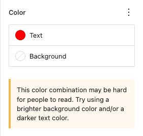
For text-based content to be accessible, you should ensure there is high contrast between the text color and the background. If text color is too similar to a background, or when using certain color combinations, it can be difficult for users to access the information. WordPress has built in tools to help you gauge whether or not text is readable. When you use the Styles Setting, WordPress automatically detects color combinations that may be difficult for some people to view.

You can also review the Accessibility Checking Tools at the bottom of this page to check color contrast.
This sentence has high contrast because it’s black text on a white background.
This sentence also has high contrast and is easy to read.
This sentence can be more difficult to read for some people.
This sentence is challenging for most people to read and impossible for people with certain kinds of color blindness to read.
Descriptive Hyperlinks
Using descriptive phrases for hyperlinks will make your documents and web pages more accessible because it gives readers more context about where links go, makes it easier to find the link they need, and for people using screen readers, the ability to differentiate one link from another.
Here is an example of a descriptive hyperlink and two less descriptive links:
- Recommended – Descriptive title/phrase with hyperlink:
Smith Libraries Course Reserves Faculty Information - Avoid – Generic phrases without context:
Click here - Avoid – Full text of the URL:
https://libraries.smith.edu/services/faculty/course-reserves
Alternative Text Descriptions for Images

Alt text (alternative text) is the description that a screen reader will read aloud when it reaches an image in a document or webpage. Descriptions should be used on all images and are especially important when an image is communicating important information so that people using screen readers can access the same content.
- Keep Alt Text short and descriptive (up to about 125 characters).
- Don’t include phrases like, “image of” or “photo of”.
- Write good Alt Text to describe images.
(Harvard Digital Accessibility Services). - Everything you need to know to write effective alt text (Microsoft).
- WebAIM: Alternative Text. WebAIM provides a thorough overview of how to write alt text for images, including how to include alt text for images that link to other pages or content.
Video Captions and Transcripts
All video content should have accurate closed captions that users can switch on or off when viewing video content.
- Youtube Captioning – If you’re using YouTube to host your videos, you can correct the subtitles YouTube creates automatically.
- Find out how to create manual captions at Add subtitles and captions – YouTube Help and how to use Youtube’s machine captioning at Use automatic captioning – YouTube Help.
- Panopto Captioning – If you’re using Panopto to host your videos, you can request automatic captioning and manually correct those captions.
- H5P Accordion – The H5P accordion tool allows you to add additional content, and works well for including a separate video transcript if added below the video.
- WordPress Details block – The details block is another option to create a separate video transcript.
Audio Transcripts
All audio-only content should be accompanied by a transcript, most often as a separate file. Transcripts are helpful because they’re a searchable version of the audio content, and are useful for studying, printing, and taking notes.
- Otter.ai real-time transcription – The free version of Otter.ai lets you transcribe up to 45 minutes of audio at a time. Much like other speech to text services, transcripts will not be completely accurate and should be reviewed and edited before sharing.
- Panopto Captioning – If you’re using Panopto to host your podcast, you can request automatic captioning and manually correct those captions.
- H5P Accordion – The H5P accordion tool allows you to add additional content, and works well for including a separate video transcript if added below the podcast.
- WordPress Details block – The details block is another option to create a separate podcast transcript.
H5P Content
Most–but not all–H5P content types have accessibility features built in and are tested by the H5P code development. When you create content within H5P, make sure to fill out any Alt text fields and follow the previous recommendations about text contrasts and links. You can find a list of which H5P content types are accessible and more information about accessibility testing at H5P’s Recommendations and overviews of content types – H5P.com page.
Accessibility Checking Tools
- WAVE Web Accessibility Evaluation Tool.
- WAVE is a browser extension for Chrome, Firefox, and Edge that allows you to evaluate web content for accessibility issues directly within your browser.
- WebAIM Color Contrast Checker.
- ReadAloud: Text to Speech Voice Reader for Google Chrome.
- Sim Daltonism Color Blindness Simulator.
- A color blindness simulator for macOS and iOS to show how your content would display for users with different kinds of colorblindness.